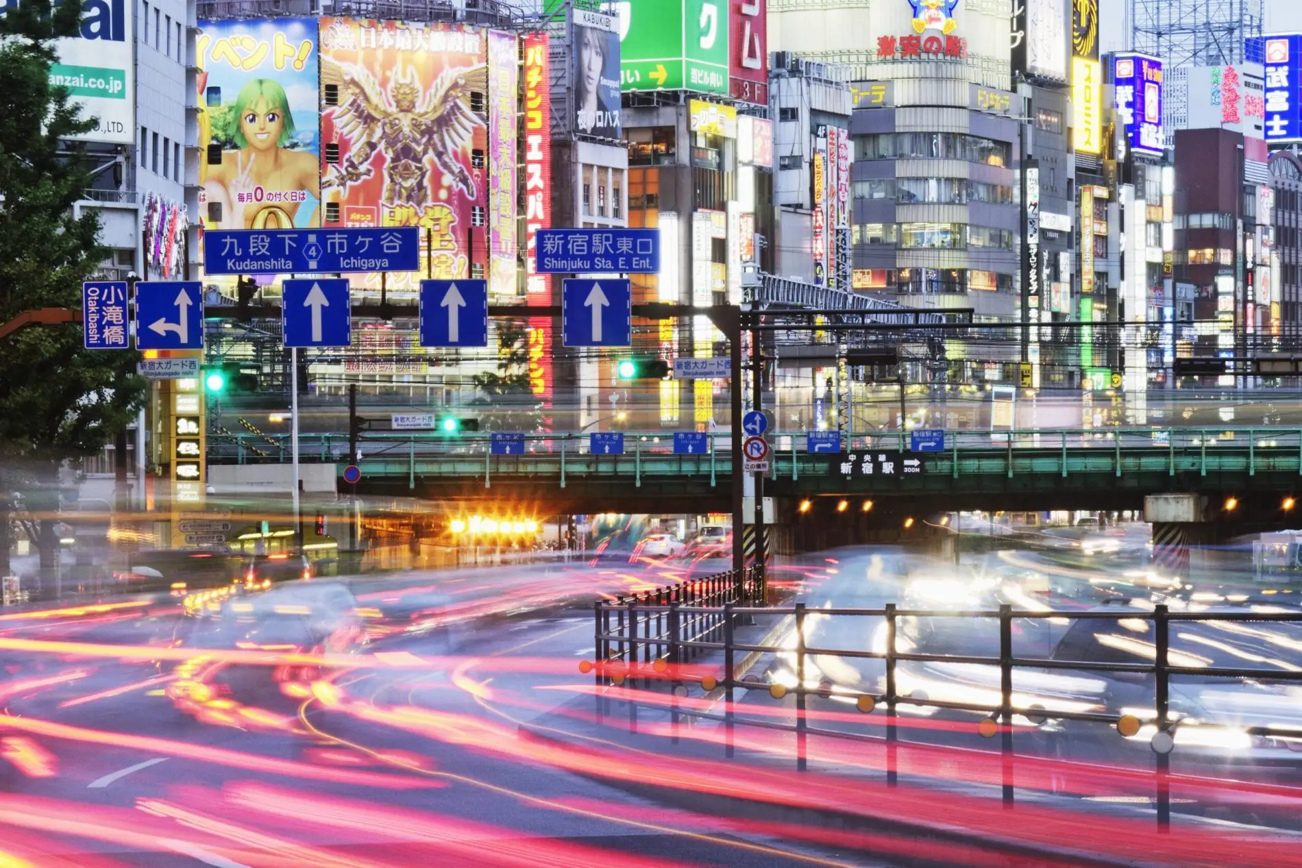
Web design trends in Japan versus the USA are a bit different. While some of the top sites in Japan are from the USA such as Google and Facebook, there are many other popular sites in Japan that have a layout that can look jumbled compared to the trend of simplistic design in the USA.
For starters: Ecommerce Website distribution:
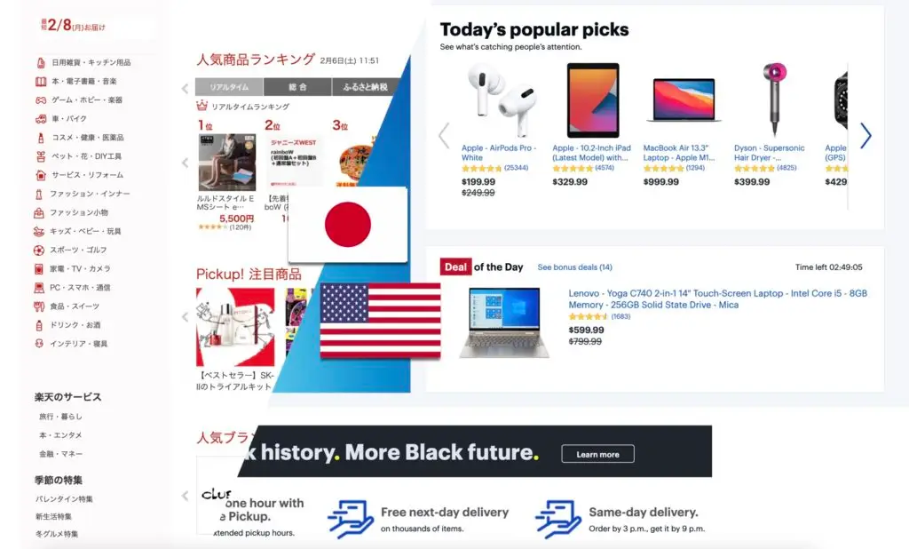
On the right side, a classic american Webs design with foreign UI design, aimed to present all the options to direct shoppers into personal categorizing. 
No product Menu, driving viewers to scroll down to separate products.
Obviously, the foreign style for ecommerce product distribution is based in clear product images, followed by basic product information and prices in Black font with comparison to previous prices.
The order total with Tax will get updated at the end product payment page, once buyer enters the shipping/pickup details.
On the Left, a Japanese traditional shopping site. Menu is immediately visible presented in clear definition of products in text written in Katakana. On the center, a crowded Menu with popular products with random categories.
Images are difficult to Visualize but the Text clearly mentions the name of the product (also in Katakana) and no clear idea of the purpose of the product. Them the price of the product in Red characters (Tax not included)
In the Japanese website, registration comes first since shipping rates and Tax comes in a very flat rate.
International shipping is rarely available, perhaps due to the language barrier and lack of understanding of international shipping requirements.
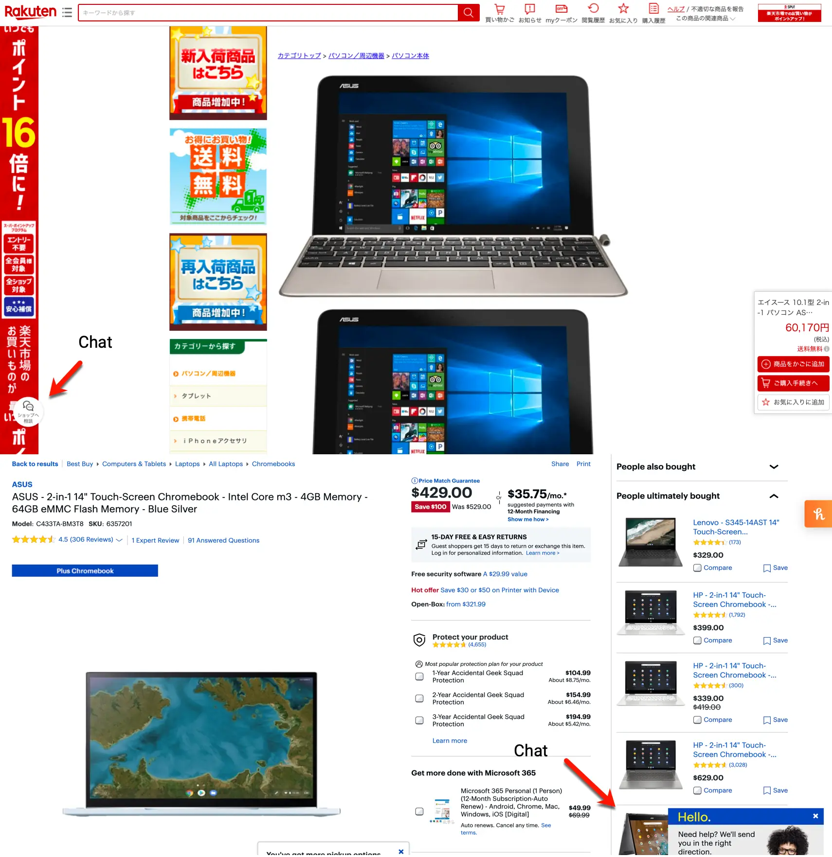
When it comes to product description, The Japanese style is aggressive in all senses. Graphic style, Font size, Visual movement in the page is tirelessly filled with constant scrolling required to reach the desired information.
There is no immediate option to compare with other products but shipping costs are immediately presented to maintain attention to pricing.
Product viewing is highly distasteful with over colored re-design.
On the other side, International design is color friendly and product information is of ease of reach. Other similar products can be seen on the left side (contrary to Japanese style) bringing options more accessible while the Japanese site presents financing payment options instead of other products.
Customer help Chat is visibly easier to find on the US website while in the Japanese site seems difficult to reach.
General graphic design balance flow.
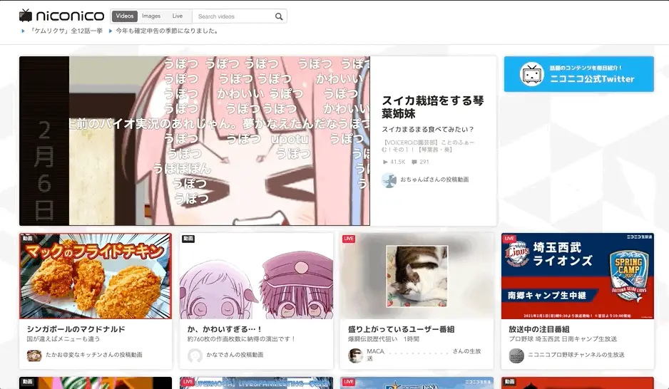
 This is an image of the Niconico homepage. The sections of the site on the desktop version seem a bit crunched together to view.
This is a screenshot of Niconico, which is a kind of competitor to Youtube and BitChute. The layout has a lot of space to the left and right, with some information smooshed in the middle. This is similar to a Japanese social media site called Mixi.

Their mobile layouts look like this.
Niconico

Mixi

In contrast there’s a trend in the USA for more designs, at least as far as the desktop version is concerned, that are more minimalistic. Here’s McDonald’s USA website for example.

Here’s McDonald’s Japan website for the record.

When localizing it can be important to know what website styles to use. An argument for the arguably more cluttered version preferred in Japan is that there’s more data on 1 page instead of having to click around, so it could be more convenient in that sense. For the minimalistic style that seems to be more generally preferred in the USA as of writing, it can help funnel people to a small amount of key essential areas easier. Here’s another example of the USA and Japanese websites.
Here’s the website for the USA.

Here’s the website for Japan.

A similar phenomenon often happens with websites in Chinese too. If your brand is expanding to China or Japan it’s important to know about this. Of course, please let us know if you’d like a website made for China or Japan.
Although it is important to note that not every popular website in Japan has a crowded layout. For example Google.com and Youtube.com as of writing are the 2 most popular, however Yahoo.co.jp is #3 and it does have that sort of crowded design. So it’s still important to be aware of.


